Atlanta International Airport App
Deliverable
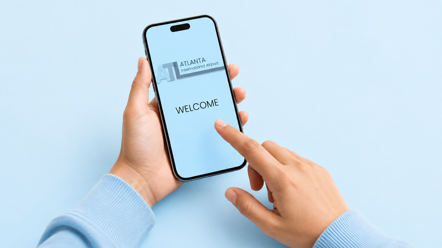
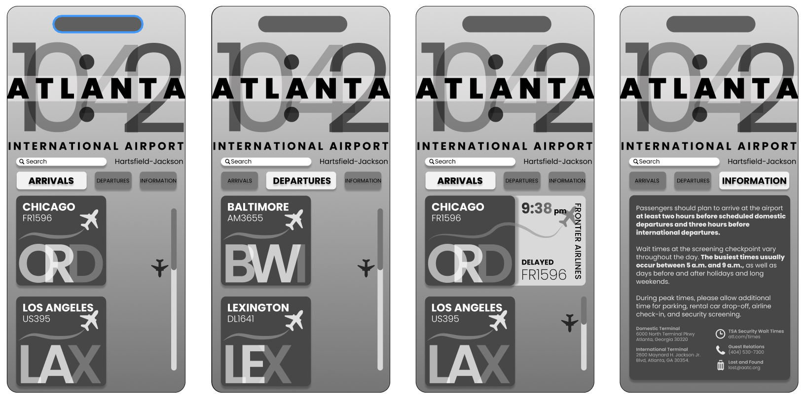
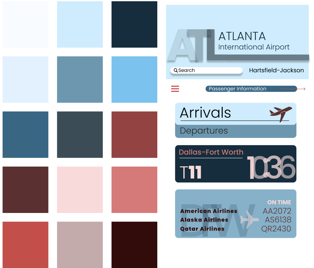
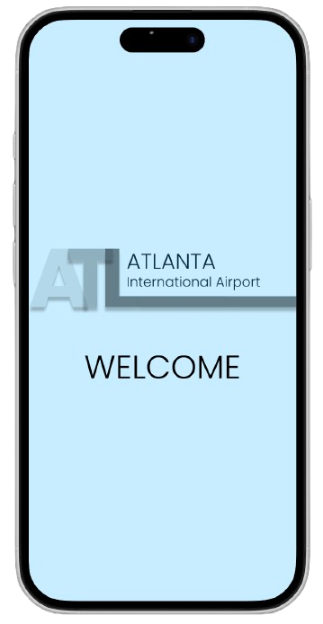
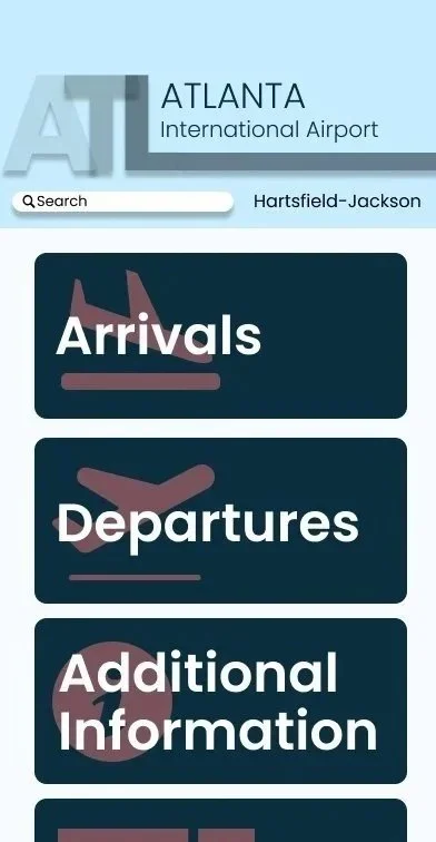
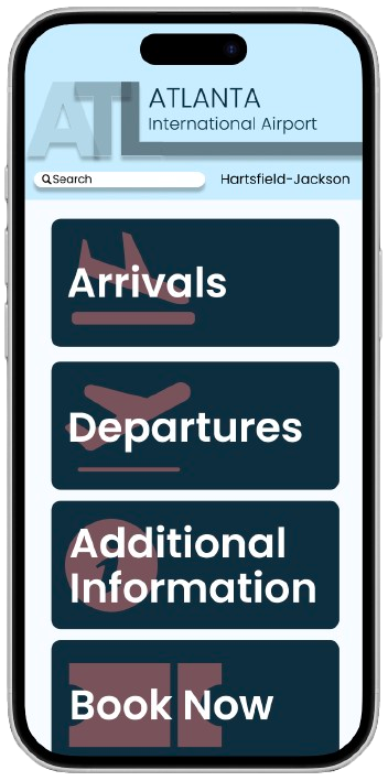
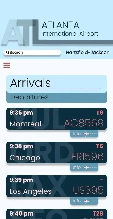
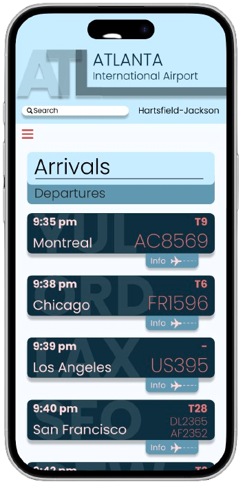
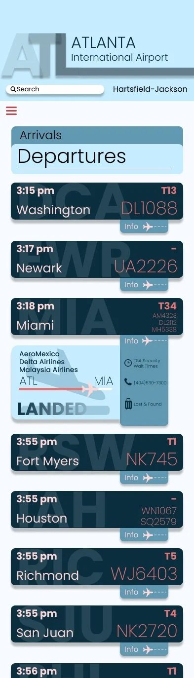
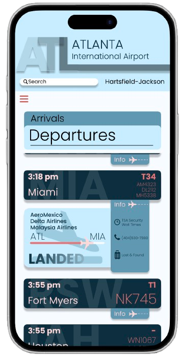
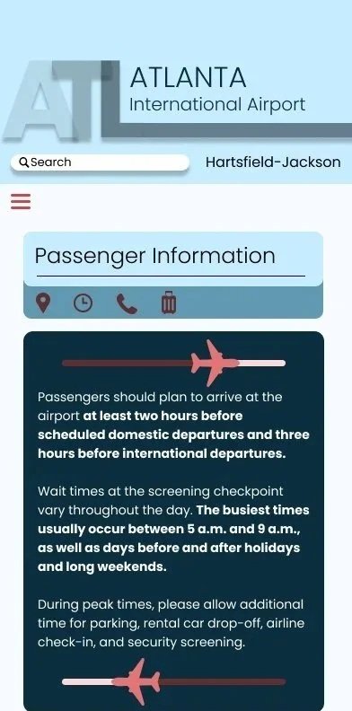
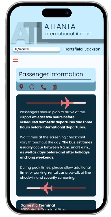
I redesigned the Hartsfield-Jackson Atlanta International Airport app using tabular typography to create a clear and organized user experience. The app includes a FIDS, detailed flight information, and airport resources, all supported by a strong typographic hierarchy and visual system that enhances readability.
Objective
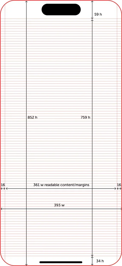
Develop a cohesive visual system for the iPhone 16 that leverages tabular typography to clearly communicate complex real-world information while enhancing readability and user experience.
Research
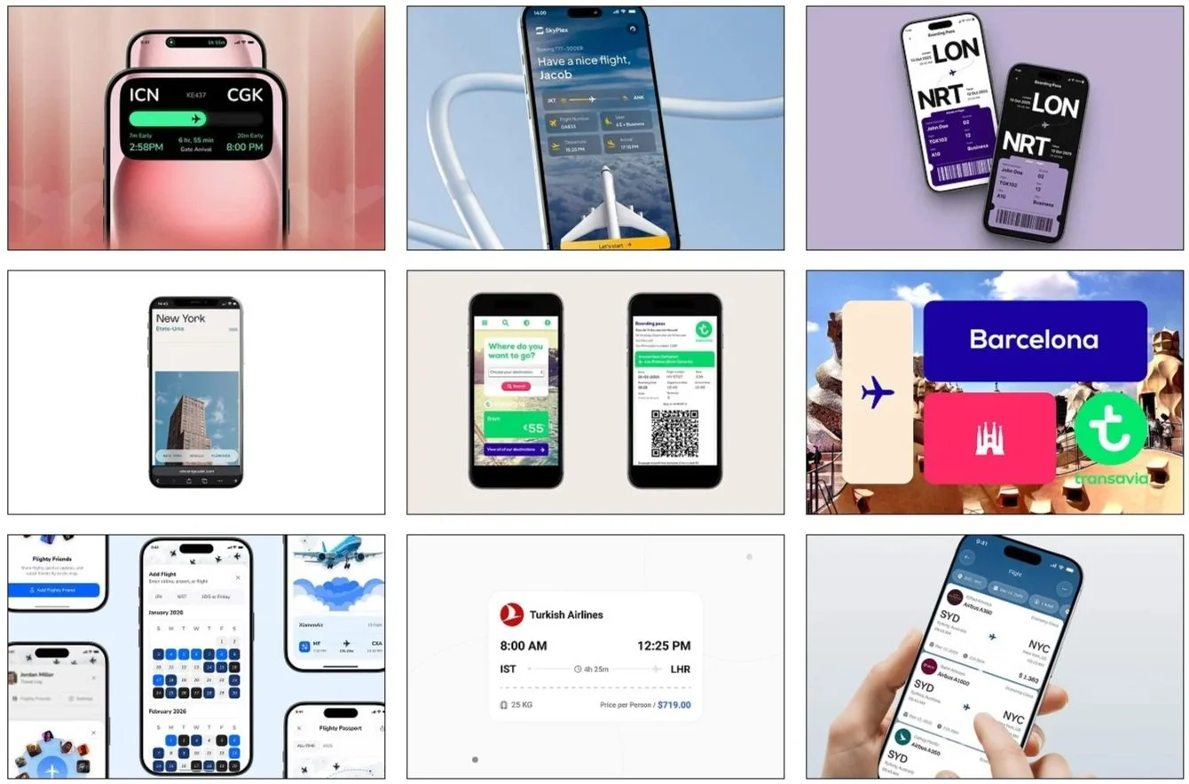
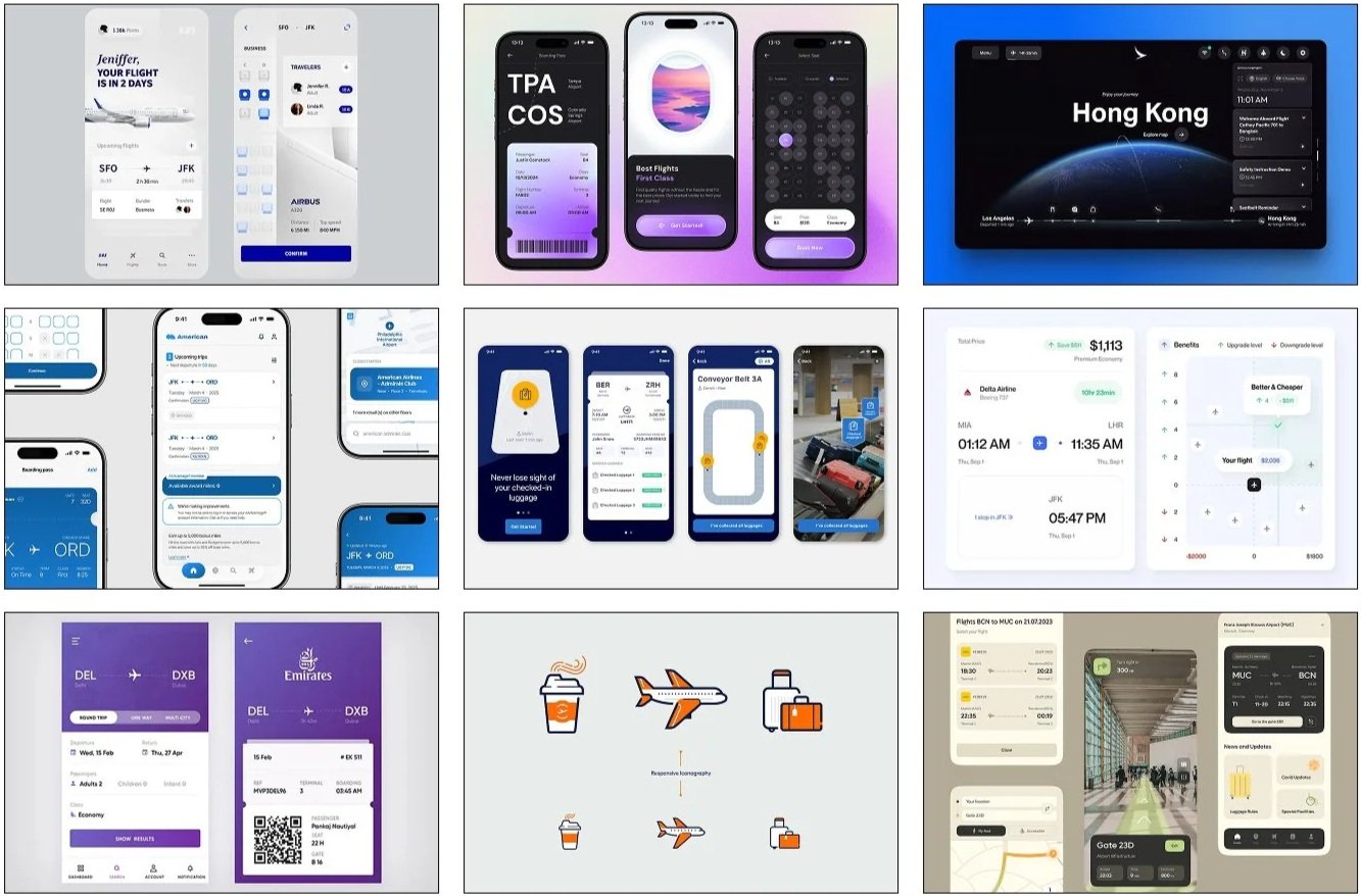
I examined the typography, iconography, and layouts of international airports in the U.S. and abroad.
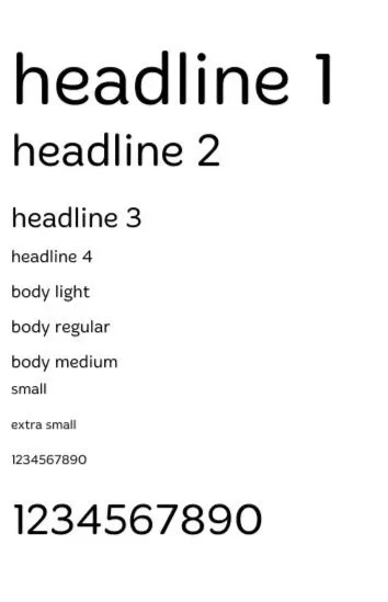
Chenla
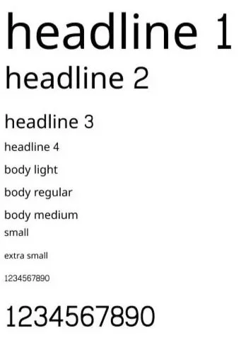
The Chenla typeface is inspired by traditional Southeast Asian scripts. It combines decorative shapes with clean lines for easy reading. Its goal is to feel both cultural and modern.
Merge One
The Merge One typeface is clean and modern, designed for clear and simple reading. Its shapes are smooth and balanced, making it versatile for different designs. The goal is to feel contemporary while staying easy on the eyes.
Niramit
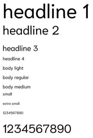
The Niramit typeface is inspired by traditional Thai script, with smooth and flowing shapes. It balances cultural style with readability. Its goal is to feel elegant and authentic while staying clear for modern use.
Poppins
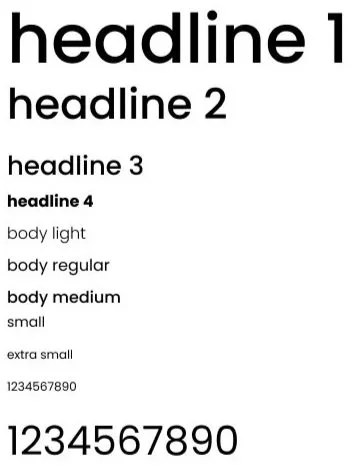
The Poppins typeface is geometric and modern, with clean, balanced shapes. It’s designed for clarity and versatility, working well in both headlines and body text. Its goal is to feel contemporary, friendly, and easy to read.
Digital Process Work
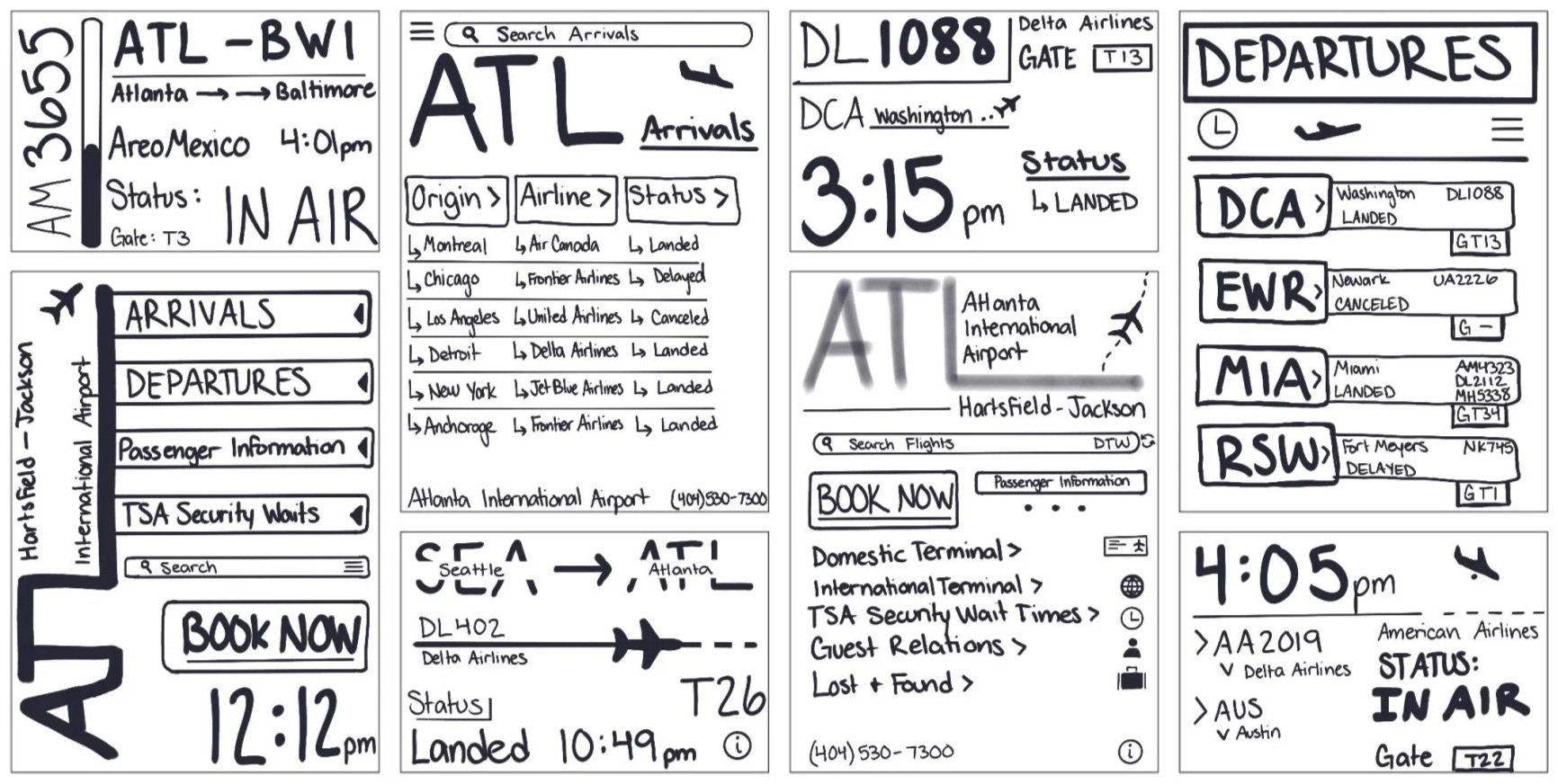
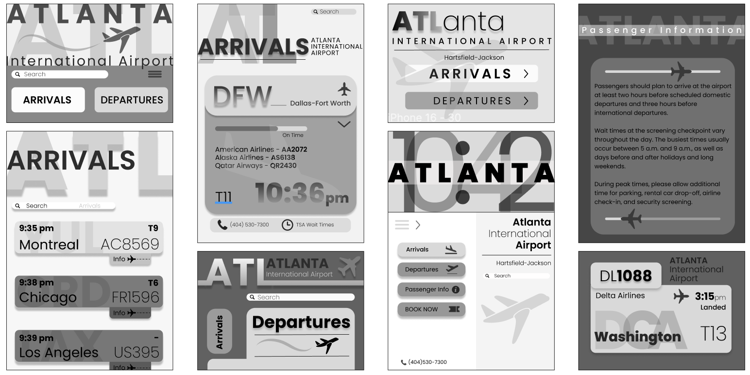
Frame Sketches
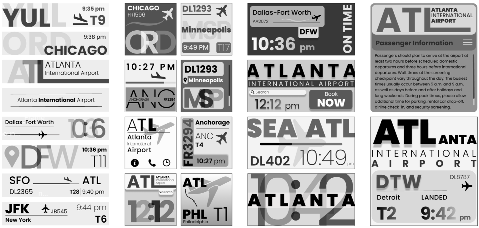
Further Exploration
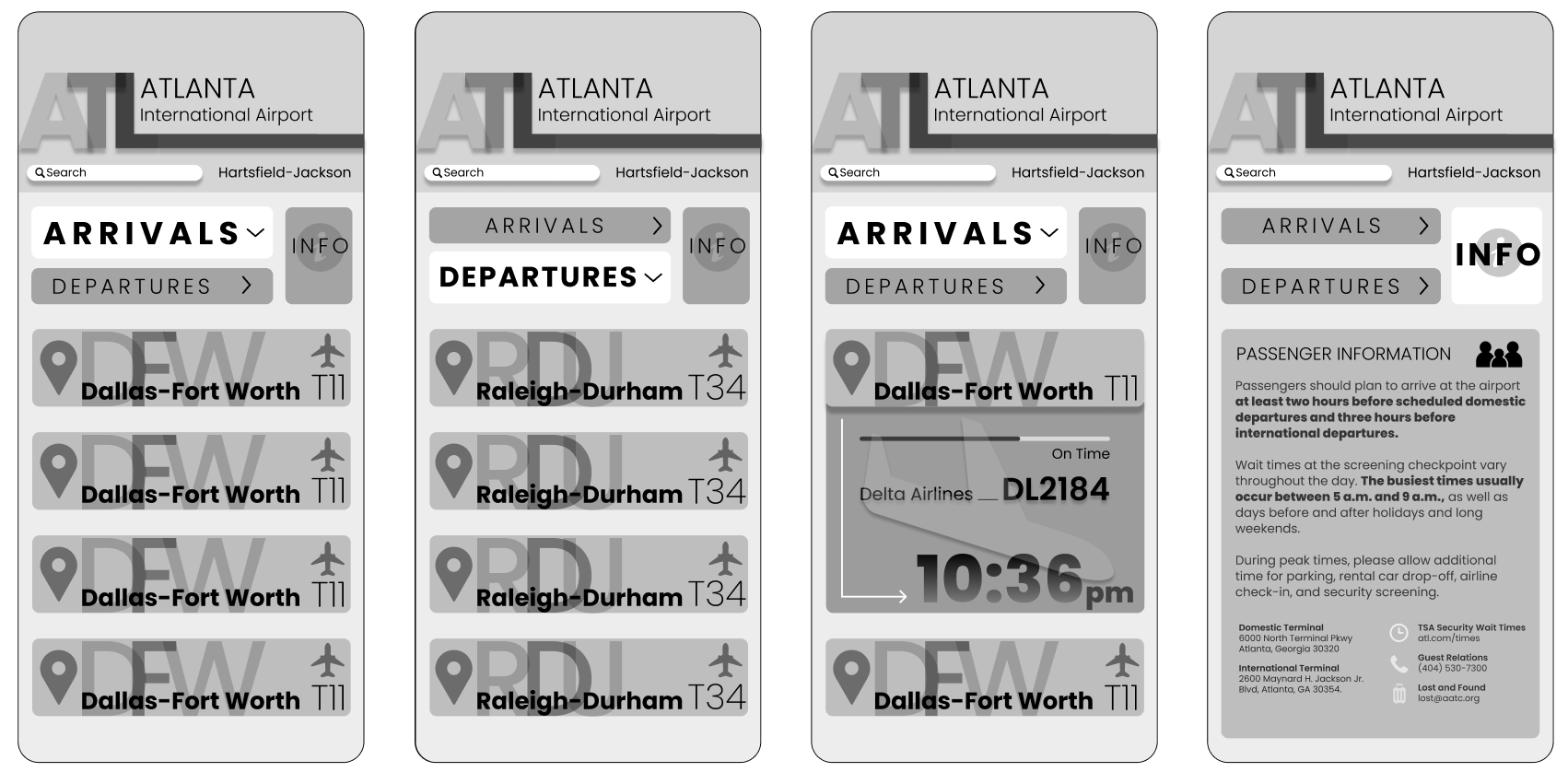
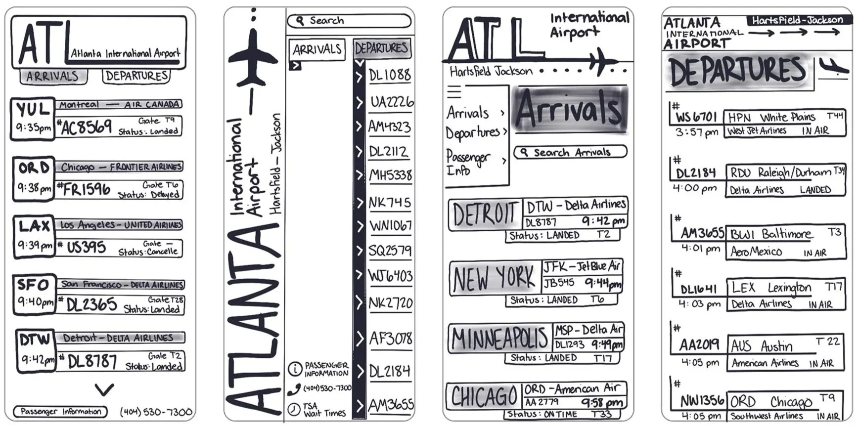
Final Concepts Directions
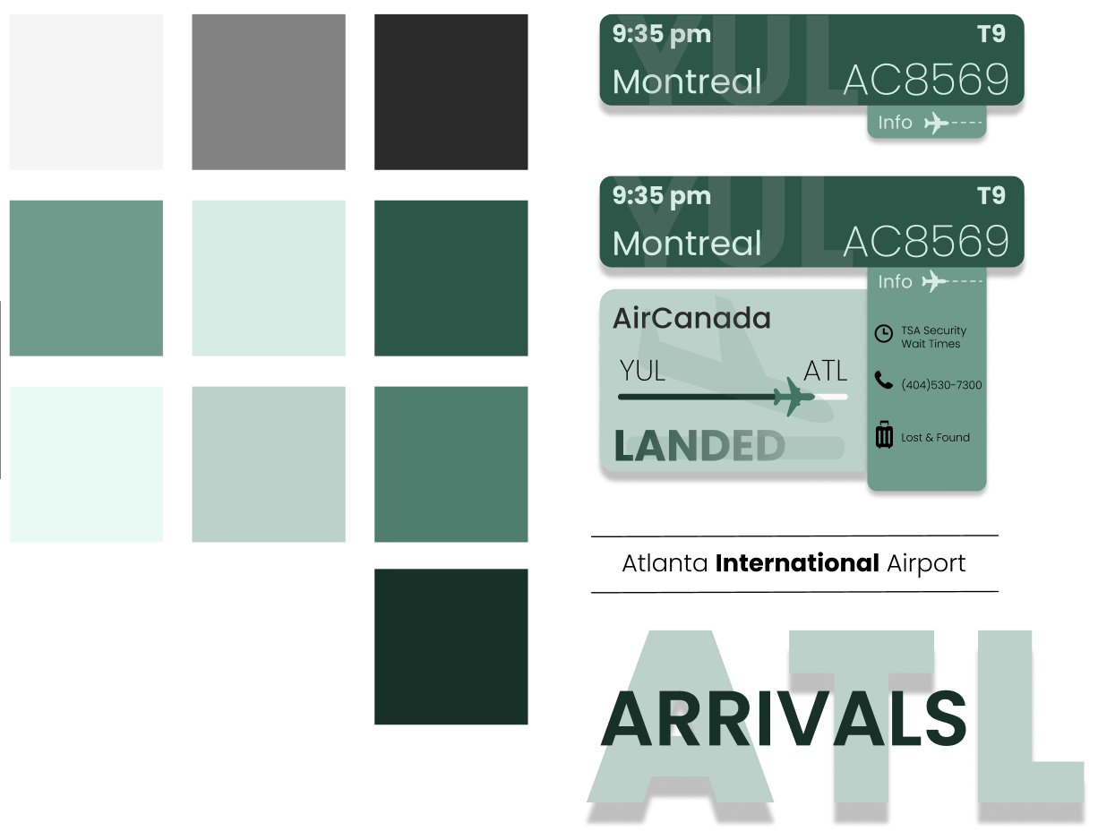
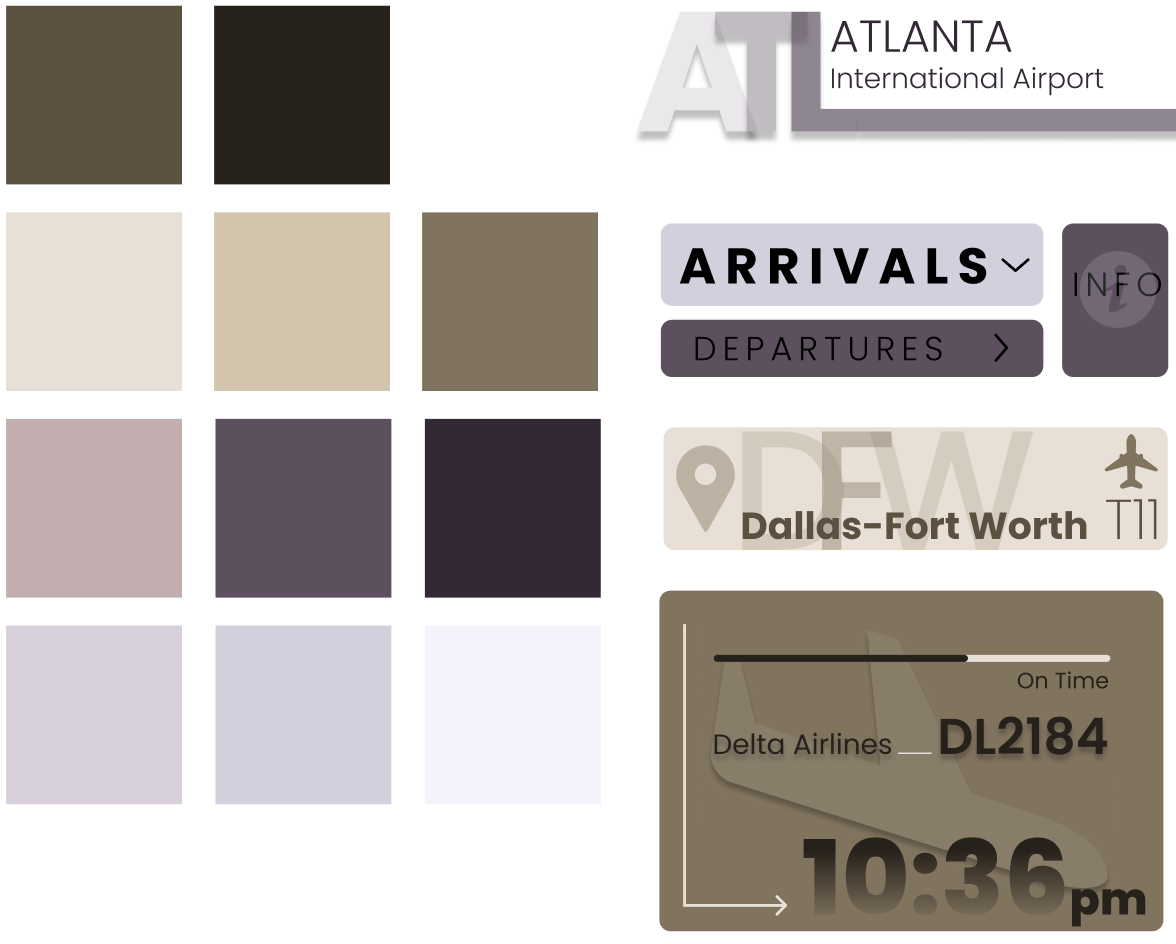
Color Ideation
Final Design

App Animation
Watch my app in action below, or click through the app yourself using my Figma Prototype!